 Athesports
Getting team content from coaches to players
Athesports
Role
Design & frontend implementation
Timeline
5 weeks (2026)
Team
Me, 2 Eng (backend & code review)
Tool Stack
Magic Patterns, Figma, FigJam, Cursor
Content library
1 / 6
About Athes

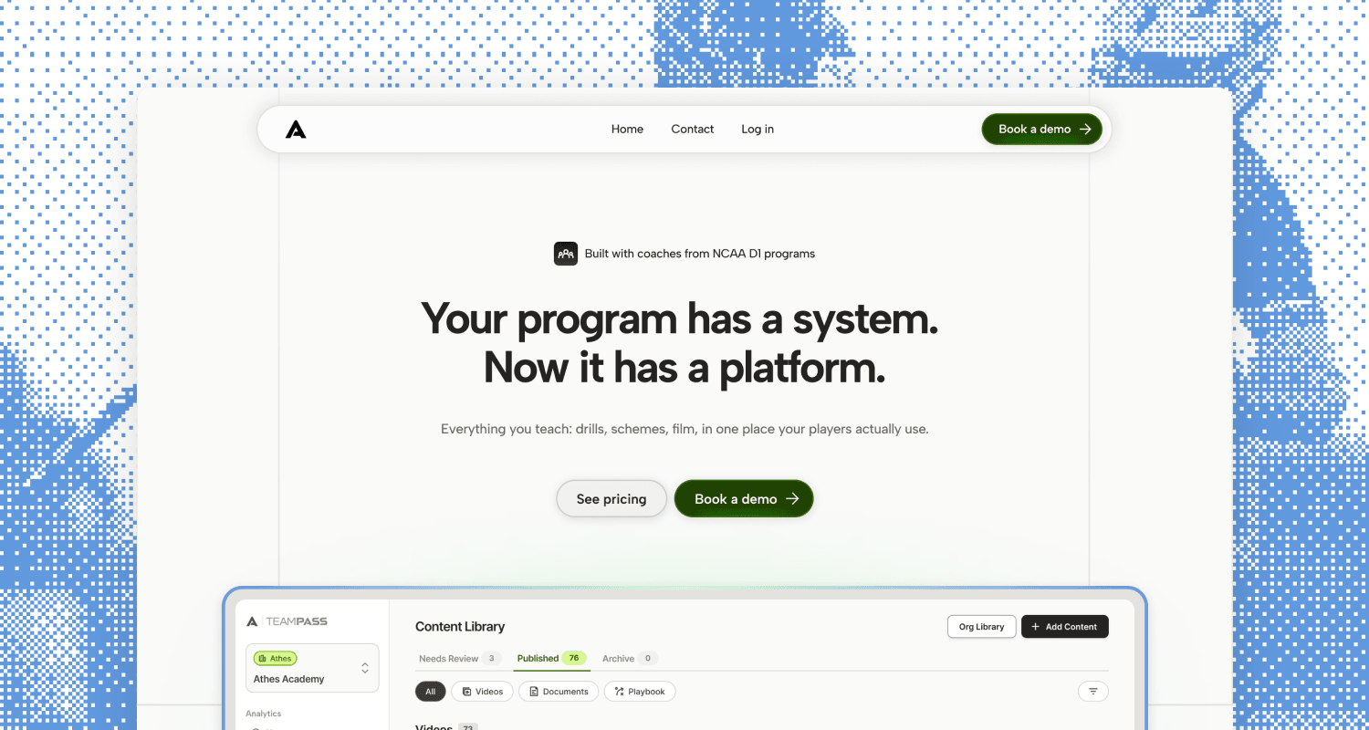
Athes is a desktop platform and mobile app for sports teams. Coaches use it to share drills, schematics, and strategy, and players review that material after practice so they keep learning off the field.
[1/5]
Problem
Coaches were running their program across too many tools
Early on, we talked to about three lacrosse coaches. Two problems came up again and again: they don't have enough time, and their content is scattered across different tools. Coaches also want to tailor their approach to each player, and following up one by one eats into the little time they have.
What coaches were juggling
Word docs in Google Drive, PDFs saved on their computer, plays drawn with pen and paper or on a whiteboard, and videos on yet another platform.
What they needed
One place to organize their content and get it to players quickly, without adding more work to their week. And a way to help players actually understand what they're looking at.
[2/5]
Approach
Starting over from a vibe-coded prototype
We built the first version in Magic Patterns. It looked fine at a glance, but when our advisor lacrosse coach tried it, he found it confusing, and once we dug in we found a lot of holes. This feature spans two platforms (coaches upload on desktop, players view on mobile), so I redesigned it from the ground up and mapped every flow end to end to make sure there were no dead ends.
The biggest barrier to adoption was metadata. Coaches don't want to re-upload everything into a new tool and then tag it all by hand. So most of my decisions came down to one question: how little does a coach have to do to get content in front of their players?
I designed everything in Figma first, then built the front end myself in Cursor. For each feature, I opened a PR with instructions for our backend dev to hook it up, and our senior dev reviewed the code.
Goal 1
Put all team content in one place
Goal 2
Cut the time coaches spend uploading and tagging
Goal 3
Help players actually understand the content
[3/5]
Execution
Every upload lands in review first
Every upload goes into the library under Needs Review. From there, coaches check the tags, add coach's notes, and publish when they're ready. Published content shows up in the players' mobile app, and coaches can move anything outdated to Archive to take it out of players' view.
I went with this instead of publishing straight from upload because tagging in the moment puts pressure on coaches and can lead to lost progress. Some coaches want to put all their content in the library at once and sort it later, and this lets them do that.
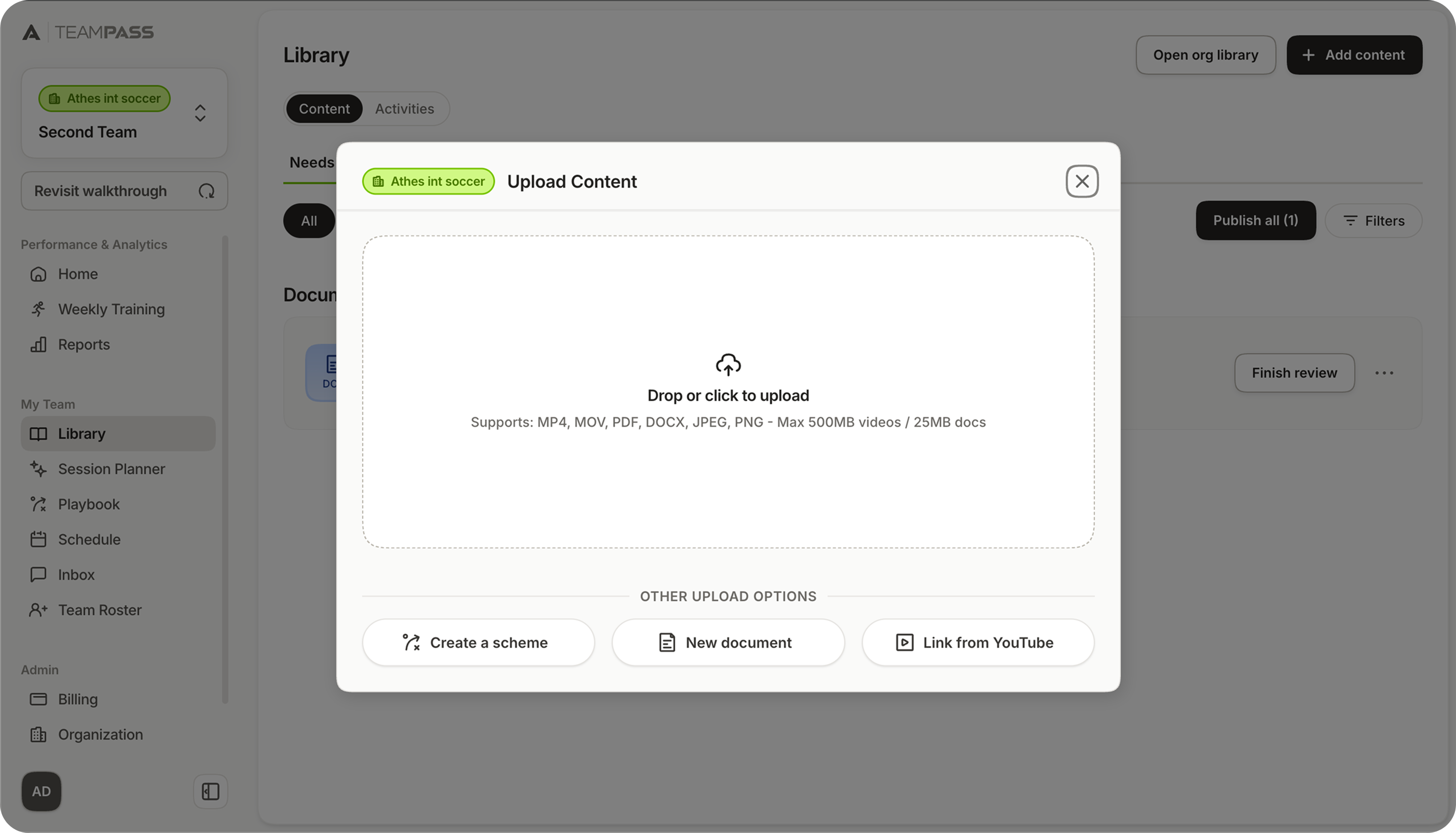
✦ Coaches upload their files here, alongside secondary upload options. Nothing publishes until they review it.
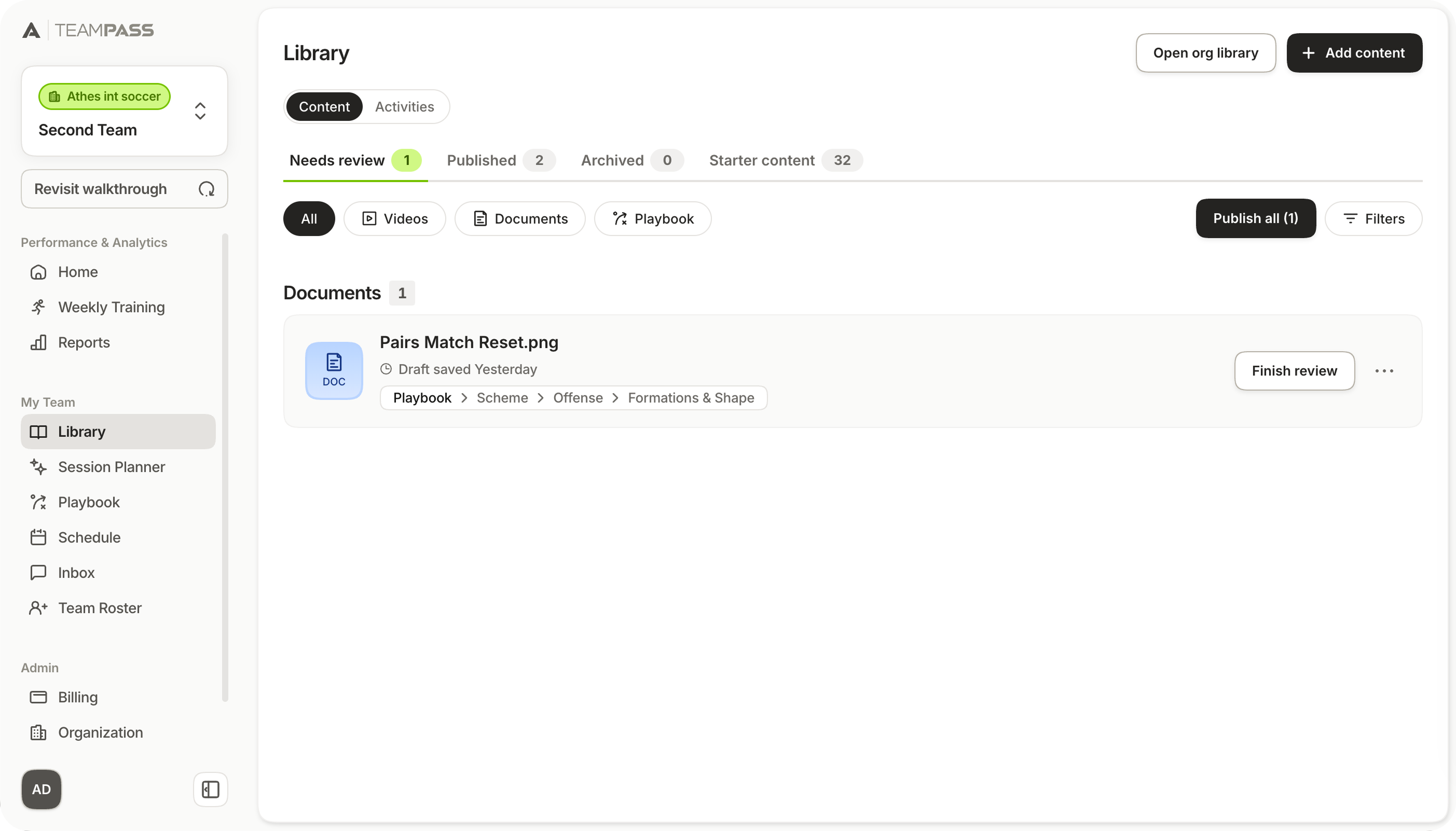
✦ Every upload lands in the "Needs Review" tab. Once it's published, it moves to the "Published" tab.
Needs Review holds files that aren't ready. Published is what players see. Archive removes something from their view without deleting the coach's copy.
Publish All is for coaches who upload a pile and want one way out. Publishing from the upload dialog would make them decide before they've looked.
Create a scheme, a new document, and a YouTube link sit next to the file drop, so coaches don't have to export something just to get it into the library.
Helping coaches organize content
Tags are a tree, but coaches only fill in two levels. The file type (Videos, Documents, or Playbook) comes from the file, so they never see that step. They pick a category, then a subcategory.
Images, PDFs, and docs all sit under Documents. Through initial interviews, we learned that coaches typically have PDFs that mix a drawn scheme with written notes, and we wanted those uploaded as they are. Our in-house lacrosse coach advisor helped define the subcategories.
For files with readable text, AI suggests the tags and writes a description. Our backend dev built the reader. It can't read videos, so coaches tag those themselves. They can edit any suggestion before it publishes.
Category tagging tree
Click to open or close the nodes below
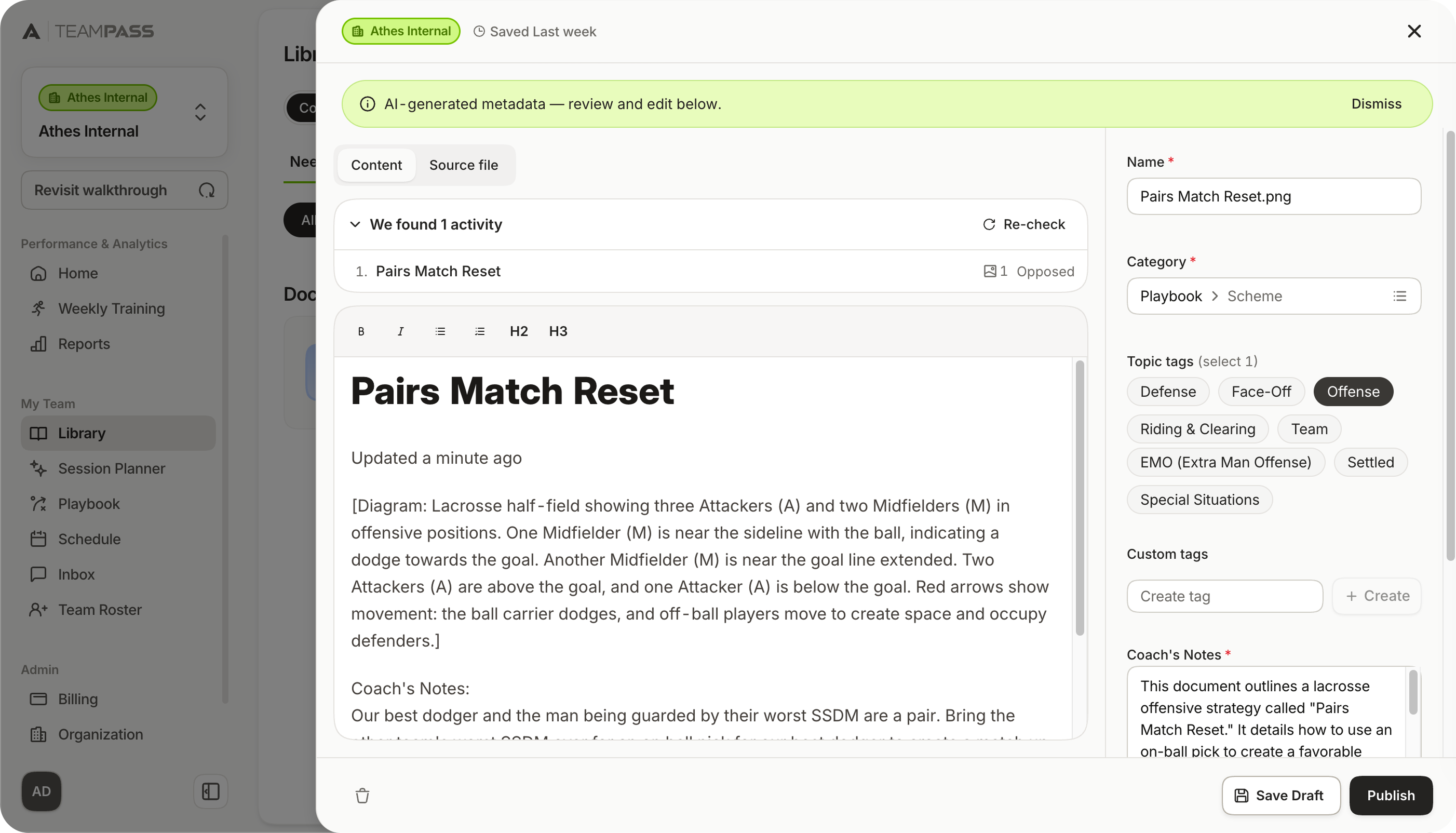
✦ Readable files open with the category, tags, and notes already filled in. Coaches review them before publishing.
Picking a category opens only its subcategories. Coaches never have to scan the rest of the tree.
The two levels cover the common cases. A custom tag is there when a coach wants a label the tree doesn't have, and they can leave it blank.
Taking plays off the whiteboard
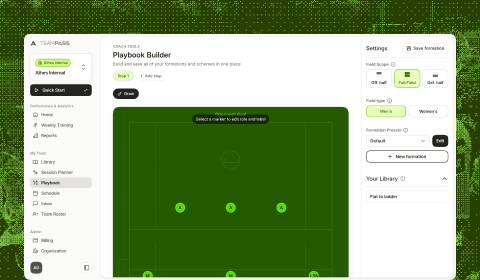
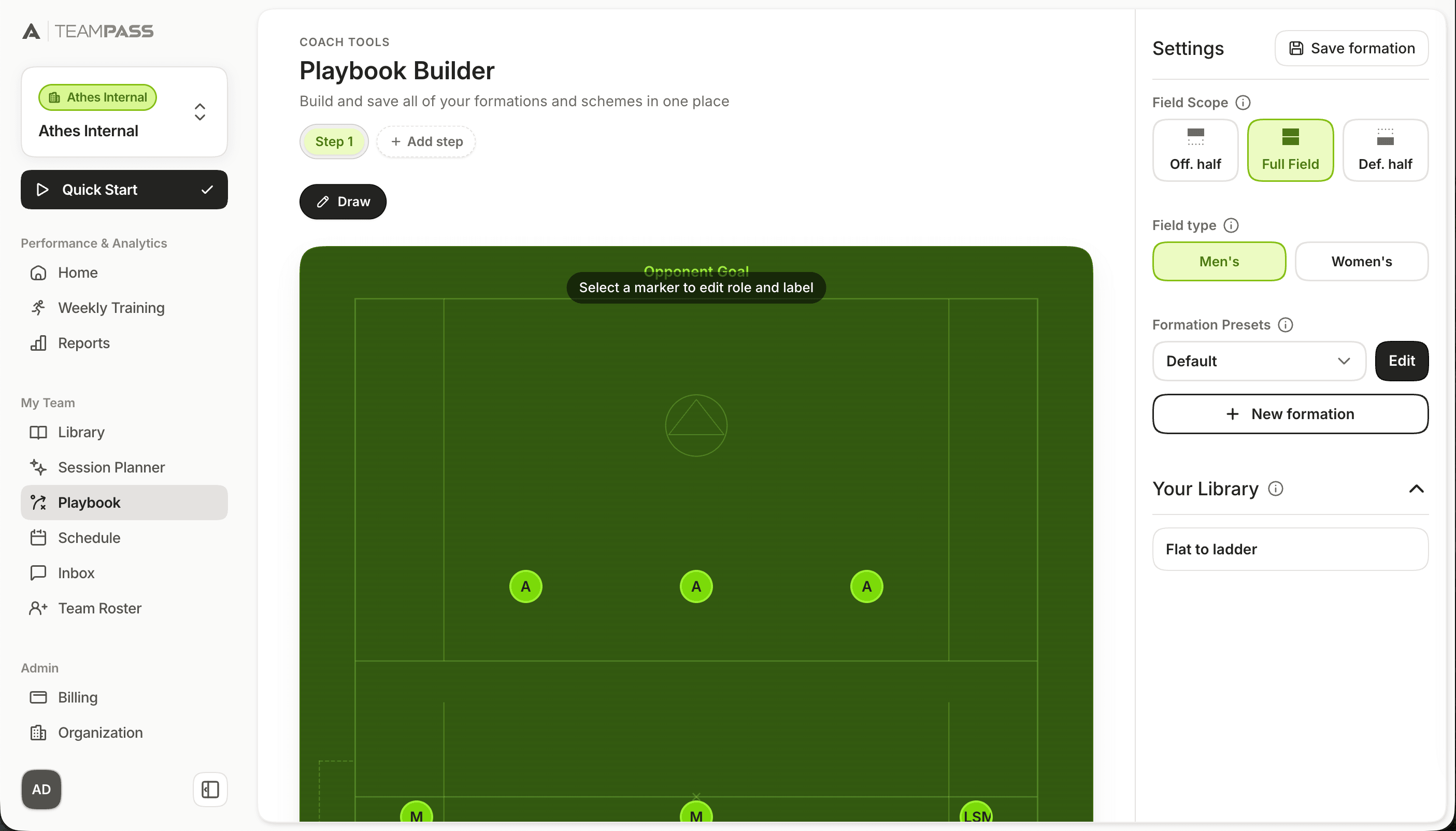
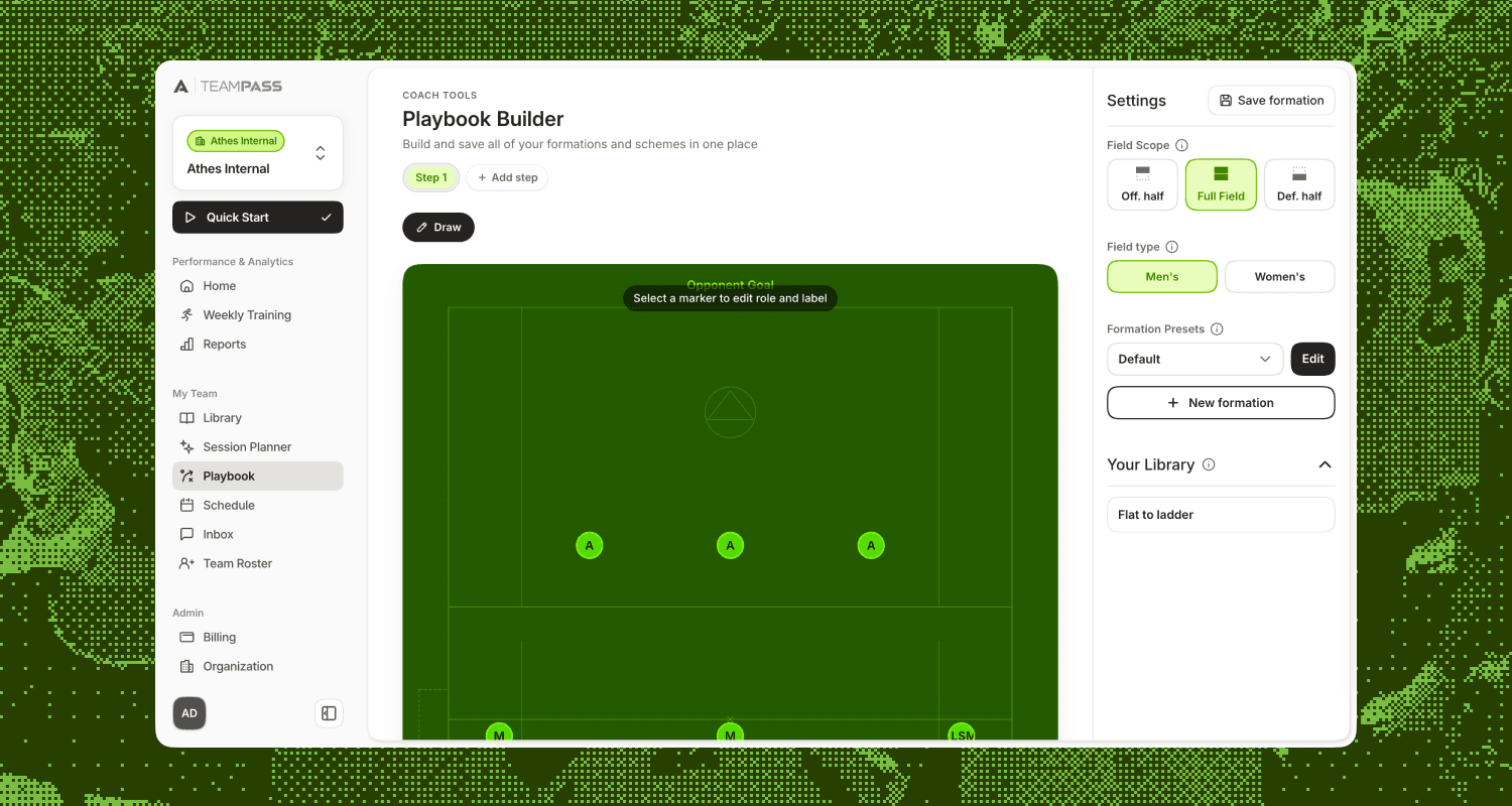
Early on, a coach told us plays still live on pen and paper or a whiteboard. Putting that in the tool would save time and cut one more platform. So we built a playbook builder: place players on a lacrosse field, label positions, and draw routes with a pencil tool.
Movement is built frame by frame. Coaches move players on each slide, and the mobile app animates between them. We considered recording a drag in real time, but once several players move it gets hard to follow. Frames make it clear where each player was and where they go next. Competitors used the same pattern, which backed the call.
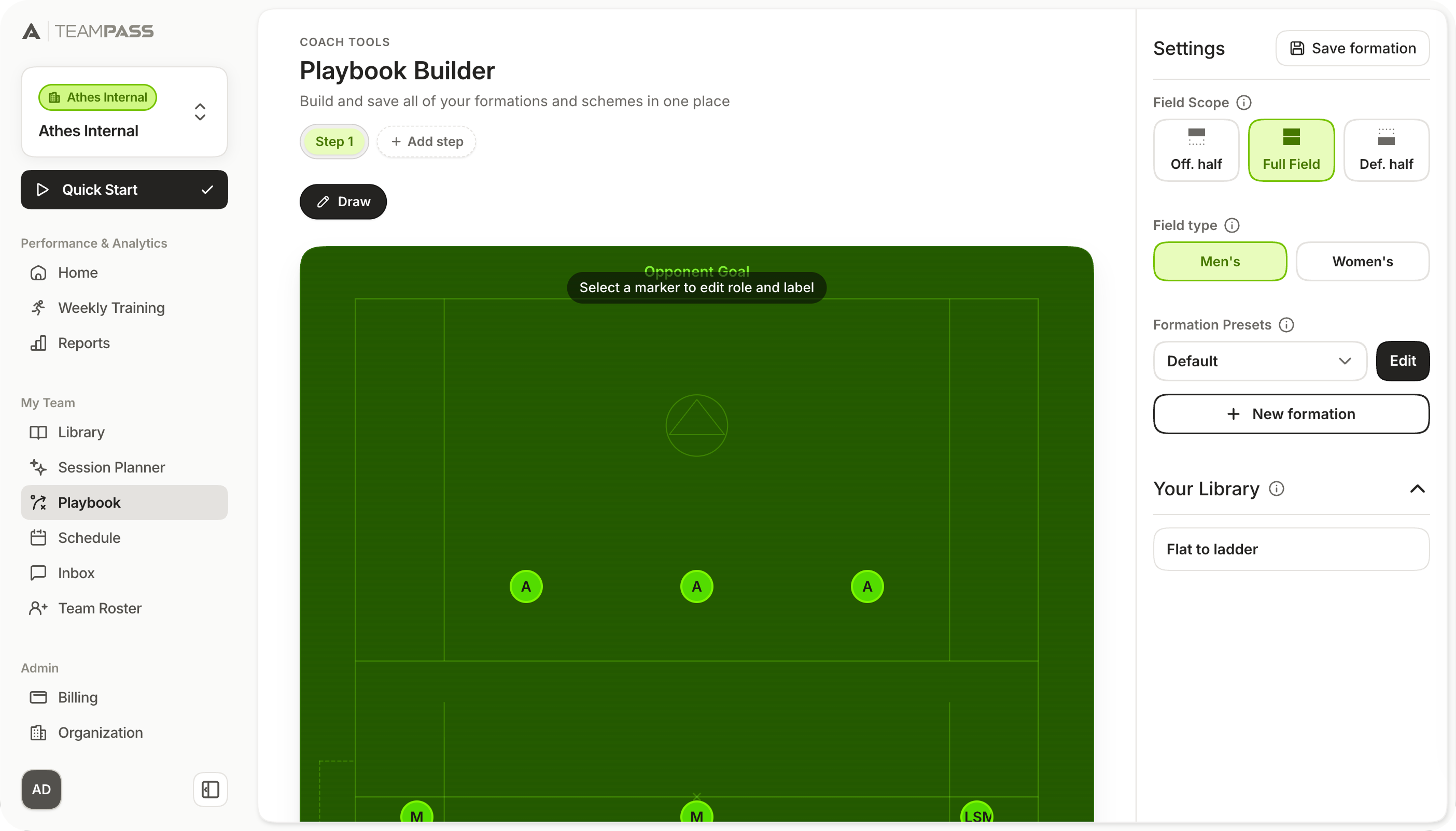
✦ Coaches set up a formation, draw routes, and add slides to show how players should move. Players see it animated in the mobile app.
On mobile, players step through each frame with toggles instead of watching one continuous motion. They can pause on a step, replay it, and see their role before the next one starts, so the play is easier to learn off the field.
Coaches can work on a full field or a half field, draw routes, and move a ball with the players across frames. Set pieces, transitions, and smaller drills all sit in the same builder.
Player notes, sorted by what they're for
Coaches take a lot of notes on their players, and those notes cover different things: how a game went, what someone needs to work on, which college coaches they've talked to. On the roster, each player has a notes drawer with seven categories: Tryouts, Practice, Game, Evaluation, Development, Recruiting, and General.
We went with categories instead of one free-text field so coaches can pull up a player's notes by topic as they add to them over a season. Same idea as the rest of the dashboard: one place to manage the team.
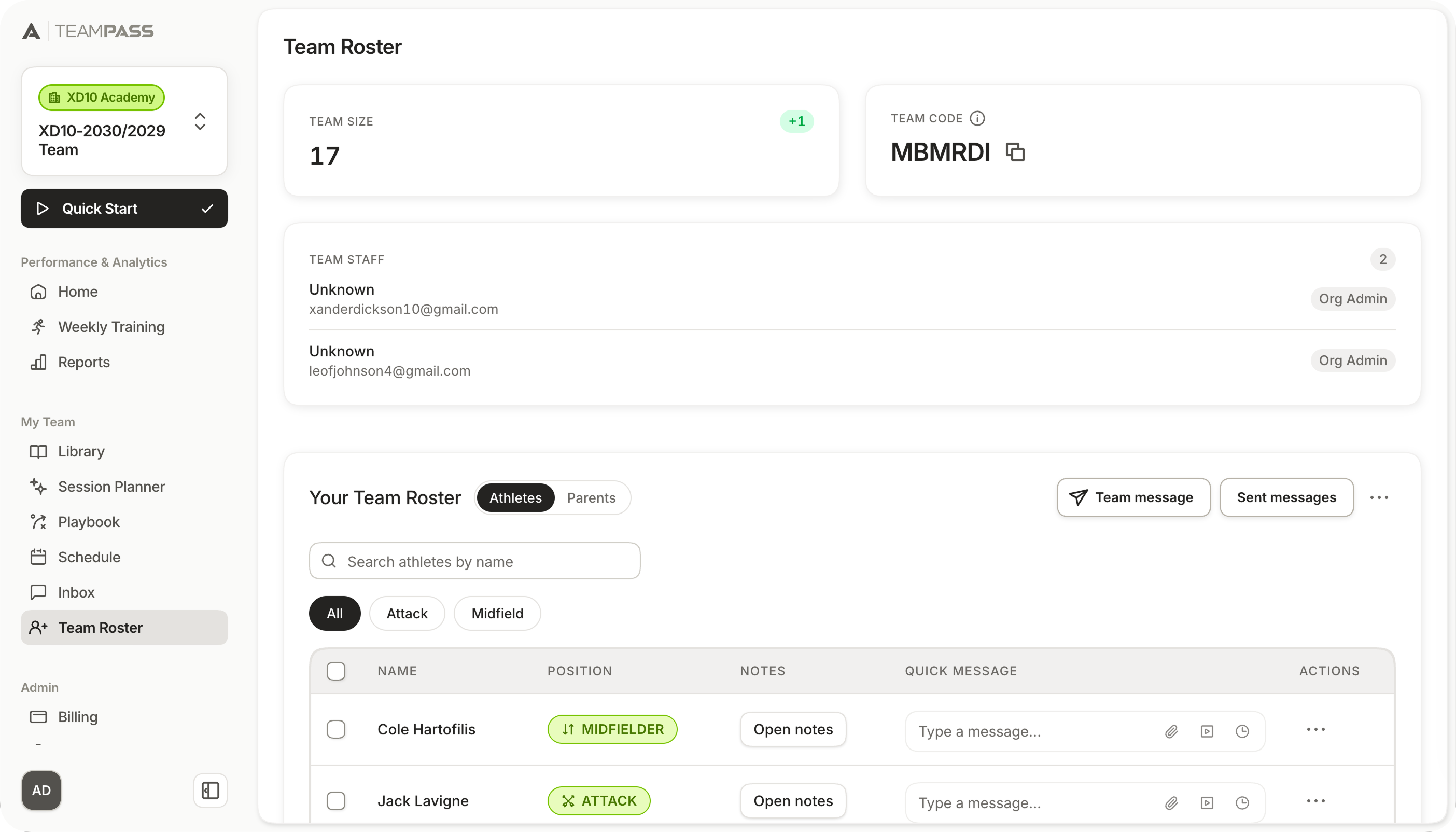
✦ The roster is where coaches see their players, send them messages, and open each player's notes.
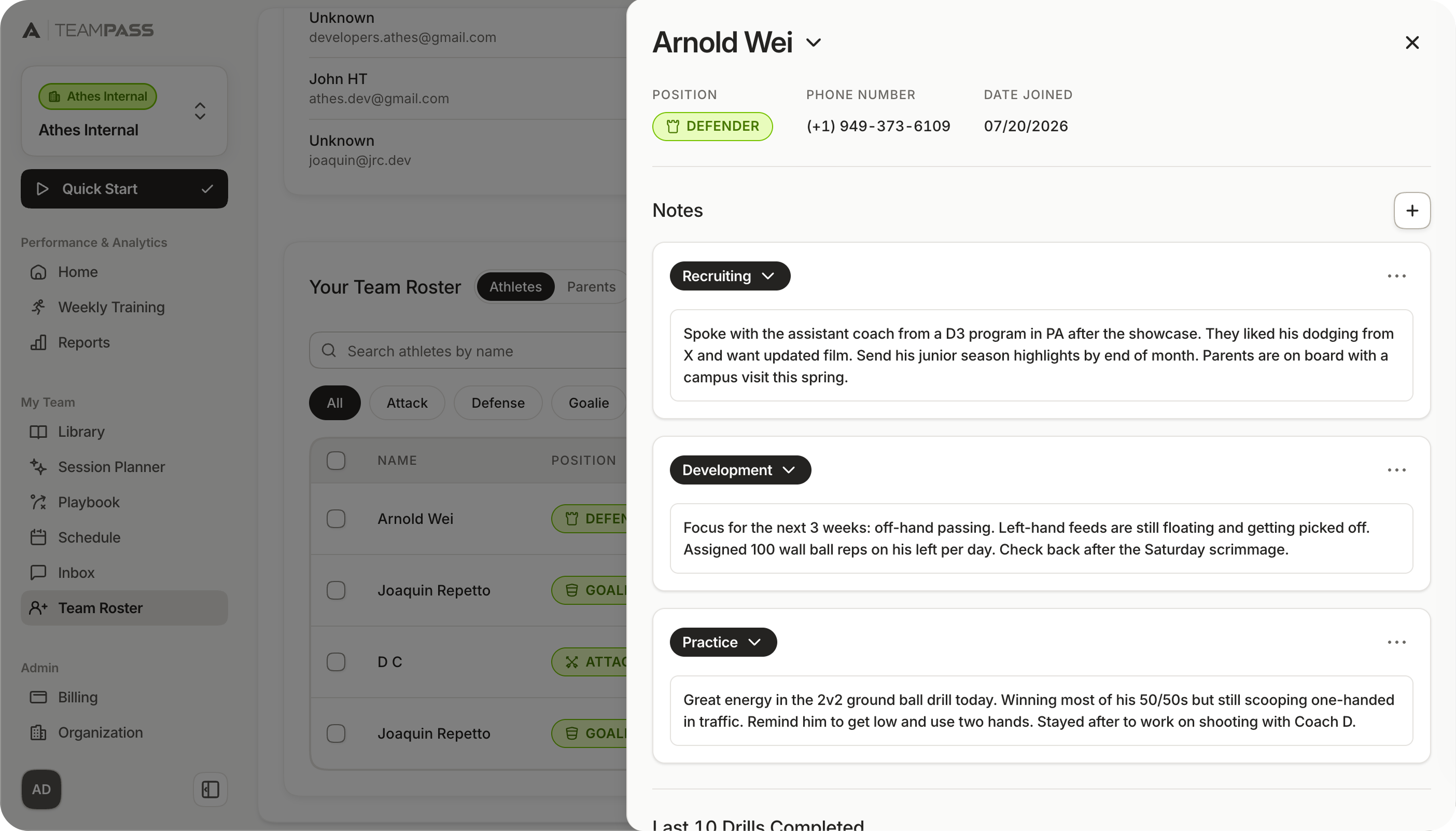
✦ Each player's notes drawer sorts notes into categories like Tryouts, Evaluation, and Recruiting.
Coaches see every player and their position, open notes, send a quick message, check roster size, and share the code to join the team, all from the roster page.
A free-text field would bury everything in one scroll. Categories keep tryout notes away from recruiting notes, so coaches aren't digging through a season to find one line.
[4/5]
Outcome
Live, and much easier than the first version
This dashboard is now live with real lacrosse teams. Initial feedback from coaches told us that this version was much easier to use than the original prototype. As an evolving product, the dashboard gets regular updates as we expand our feature set and more teams and organizations use it.
We built the dashboard to stay sports-agnostic, so the same structure can expand into new sports and markets. The library, tagging, and player tools are set up to adapt when the sport changes, and we've begun to expand into soccer.
Because the product and company are still early, usage and feedback have been limited. However, what we have heard centers on speed and ease of use, like a "Publish All" action for coaches who want to bulk publish their content rather than individually, a button we've added and shipped already.
Content library
1 / 6
[5/5]
Reflections
Thoughts & reflections
Reflection 1
Metadata was the real product.
Upload UI is easy to make look finished. The hard part was everything after the file lands: tags, review, publish. Once I treated "how little can we ask?" as the main question, the library, AI suggestions, and Publish All all pointed the same direction.
Reflection 2
Throw out the prototype sooner.
The Magic Patterns build looked fine until a coach tried it. I spent time polishing a structure that wasn't going to work. Next time I'd pressure-test the vibe-coded version with a real user earlier, then rebuild without trying to salvage pieces that were already confusing.
Reflection 3
Build for sparse feedback.
At an early-stage company, you don't get clean numbers or a long research runway. The feedback we did get kept pointing at speed and ease, like Publish All. I'd treat that constraint as part of the brief from day one: ship the smallest path that gets content to players, then tighten from real use instead of waiting for a perfect signal.

Arnold Wei
Open to product design roles!
Currently in
Orange County, CA