 Athesports
Getting team content from coaches to players
Patreon (bootcamp)
Role
Product designer
Timeline
5 weeks (2025)
Team
2 designers (bootcamp)
Tool Stack
Figma, FigJam, Zoom, Dovetail
Search menu
1 / 5
About Patreon
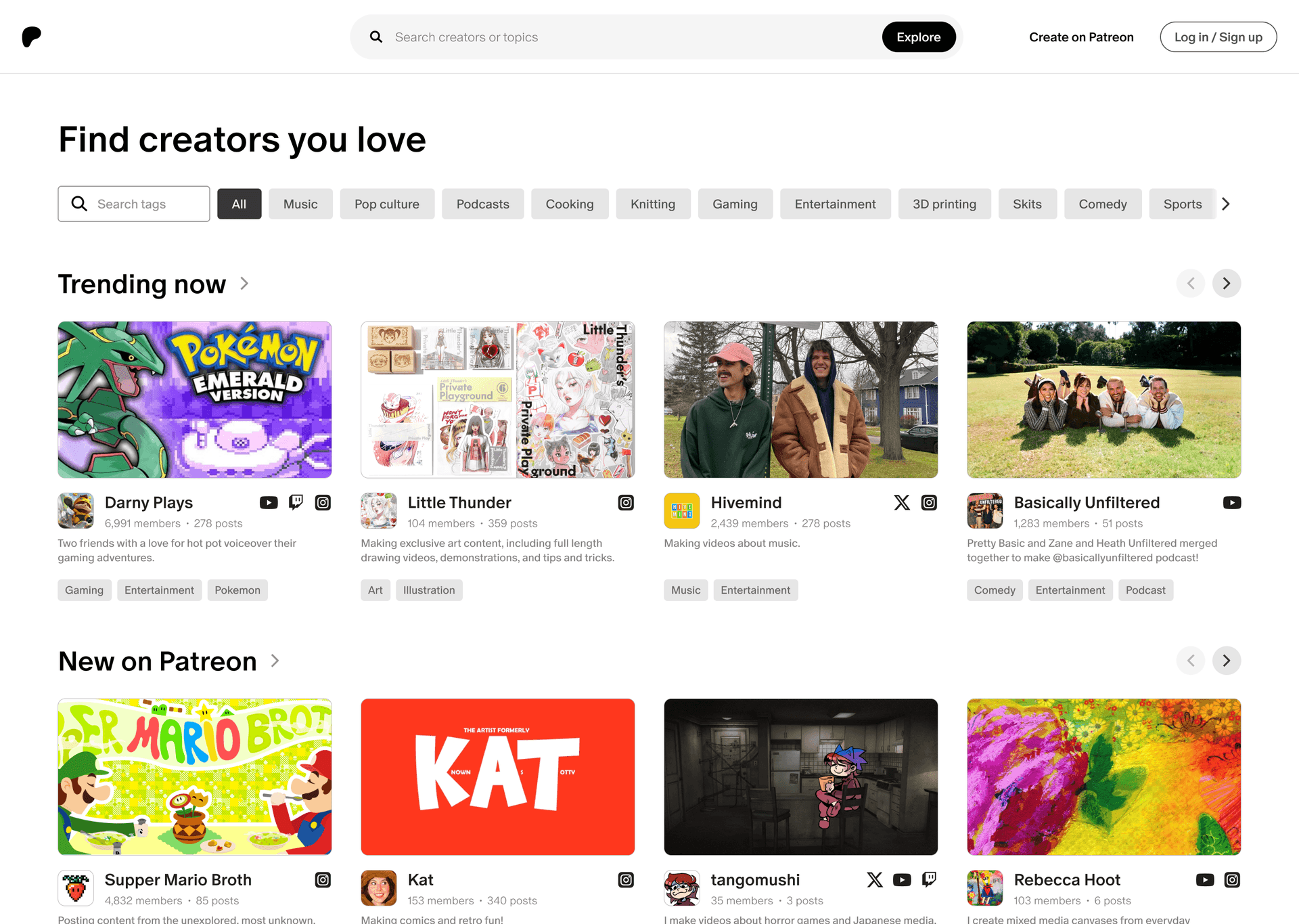
Patreon lets creators earn from their biggest fans through paid memberships and exclusive content. For a 5-week bootcamp project, my partner and I were asked to improve Patreon's discovery experience. The brief was open ended, so we focused on explore and search: how fans find creators on Patreon, and whether they find anyone worth supporting.
[1/5]
Problem
Fans couldn't tell who was worth clicking
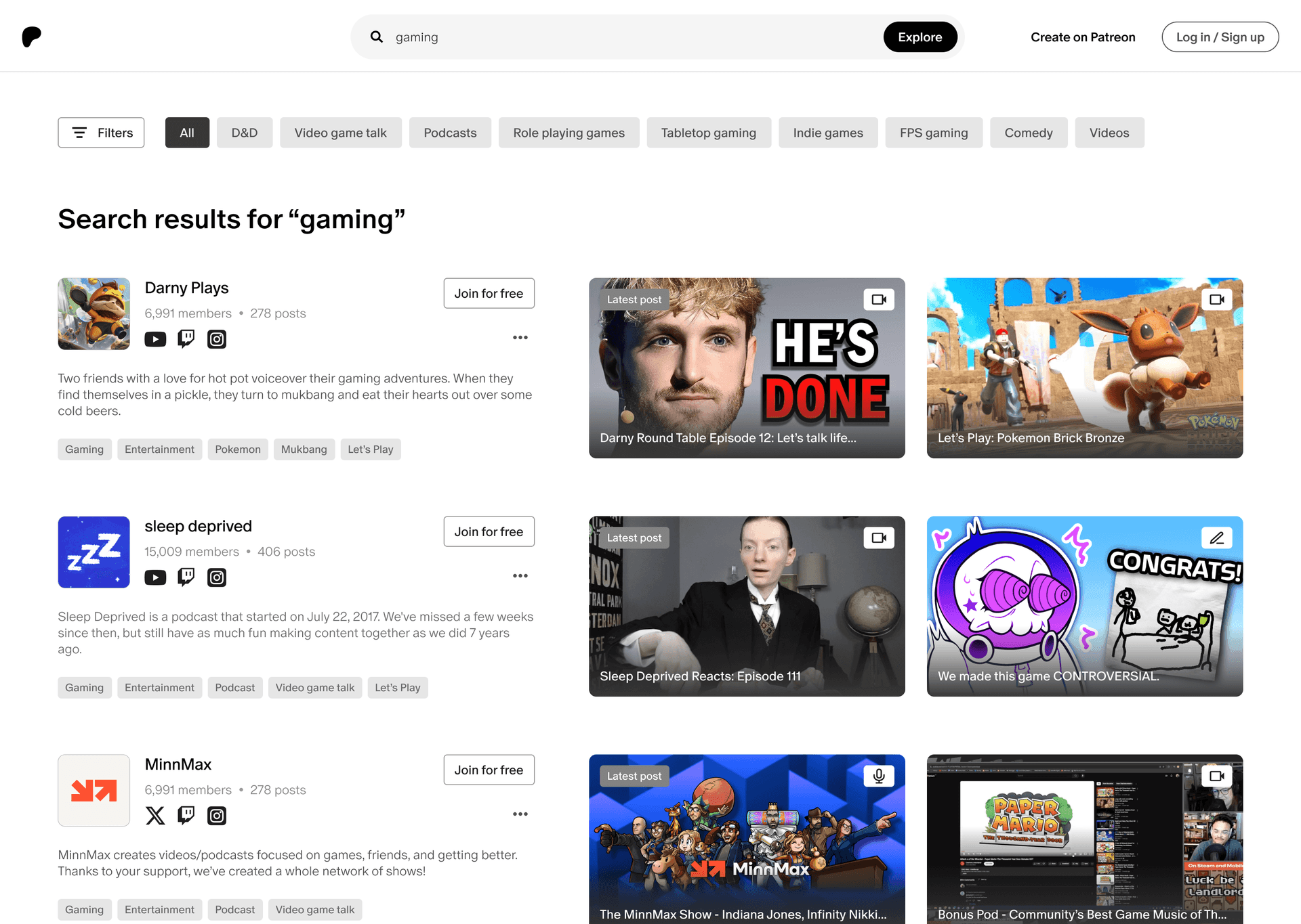
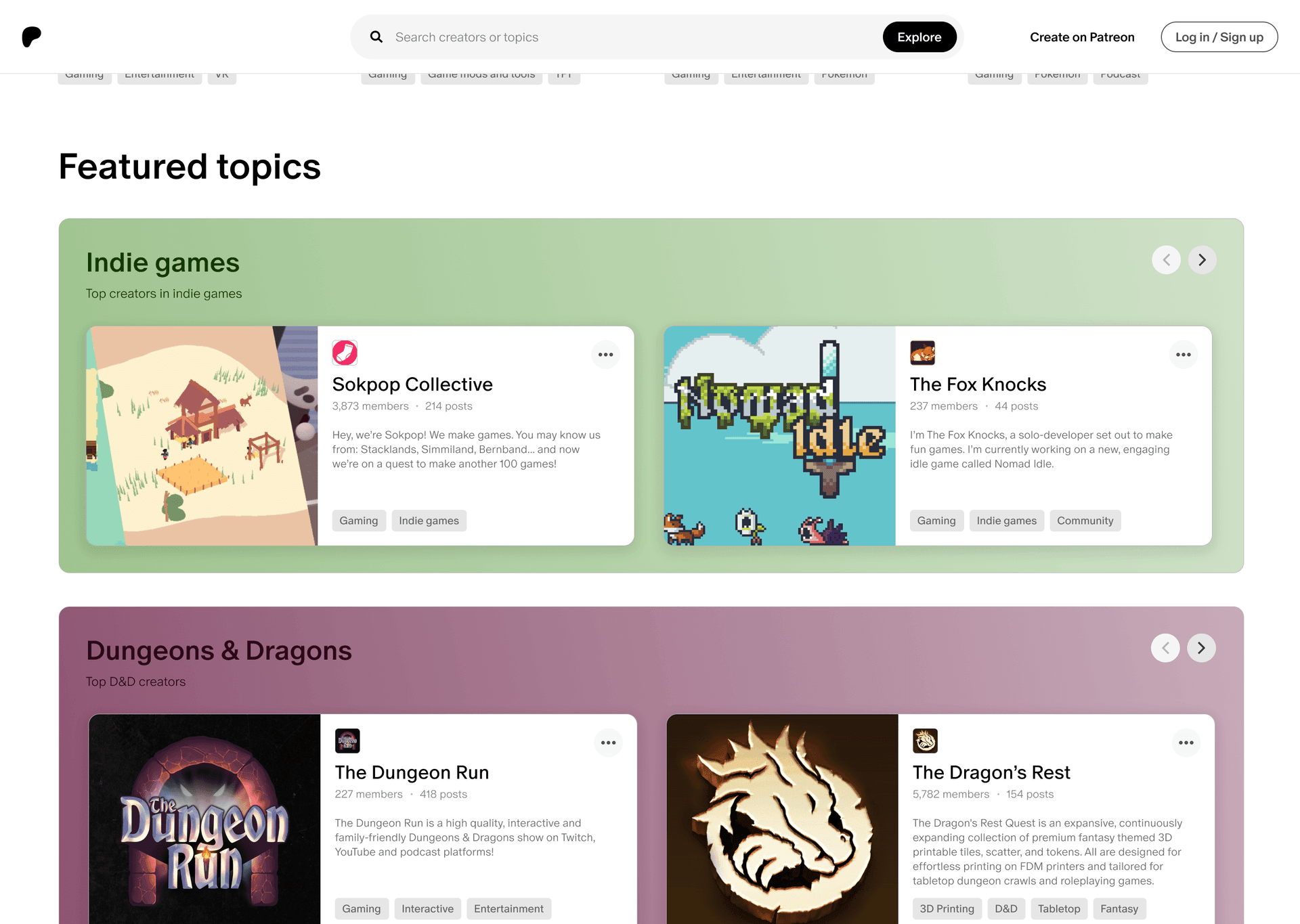
We interviewed 3 people (2 Patreon users and 1 non-user), and I led 2 of those sessions. In each one, we asked them a series of questions about their content consumption and also asked them to use Patreon's explore feature as if they were looking for a new creator, and watched for where they got stuck or hesitated. A search for "gaming" returned creators with a single line of description. Getting to explore meant submitting a blank search, and once you got there you only had 6 broad category tags and a search bar with no suggestions.
What users saw
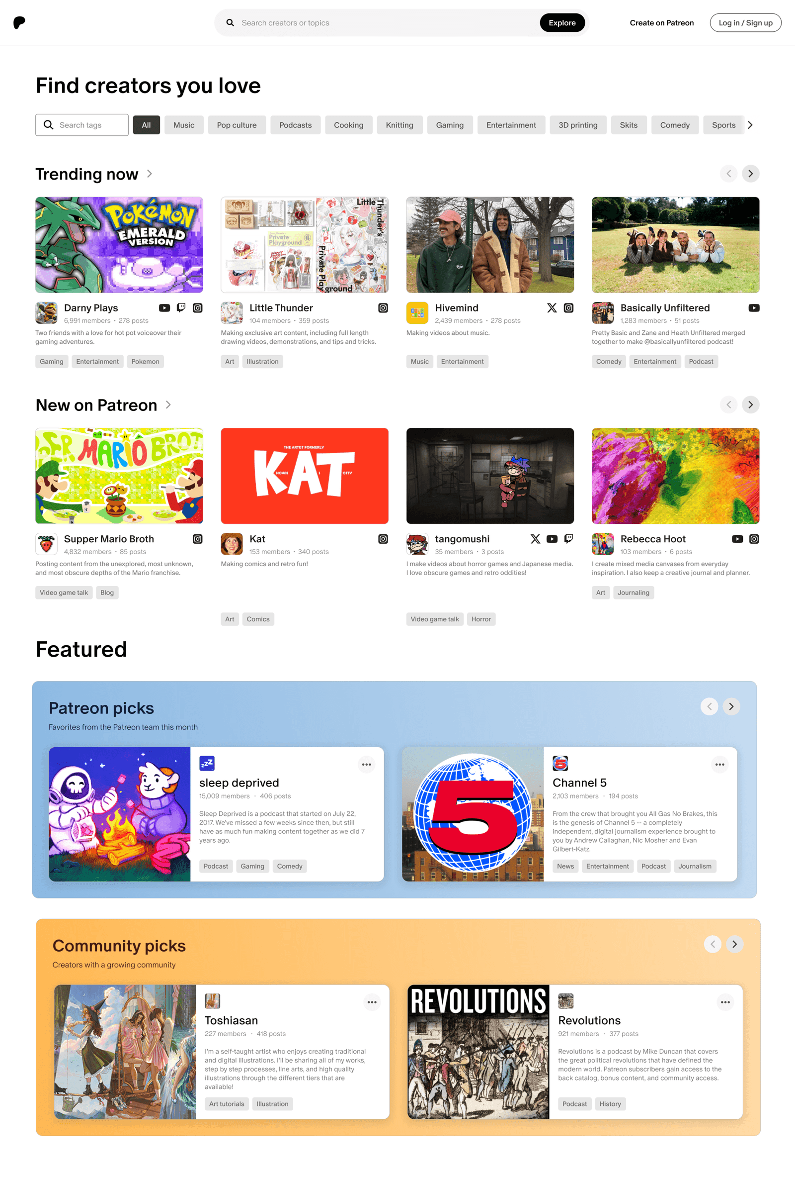
Creators with an avatar, name, and 1 line of vague text. There was no way to judge a creator without opening every profile
What they wanted
More context behind the creator before clicking in, better ways to browse, and results that better matched what they wanted to see
[2/5]
Approach
Patreon is usually the last stop
Interviews also surfaced a bigger issue. People don't usually go to Patreon to find someone new to pay for. They find a creator on YouTube or Twitch, enjoy the free content, and only land on Patreon once they want more. One participant said, "It's hard for me to imagine paying money to subscribe to a certain content creator... the internet is vast."
Discovery was our brief, so we took that as the constraint. Our bet was that discovery is where activation starts: if fans can browse on Patreon and get enough context to feel good about a creator, the path from discovering to subscribing gets shorter. More information at each step was how we planned to get there.
My partner and I wrote the interview script together, then each designed a full direction before merging. We went with my partner's layout for explore and worked through the details and hi-fi together.
Goal 1
Integrate more and better ways to search
Goal 2
Provide ample context behind a creator before clicking in
Goal 3
Let fans narrow results the way they expect and want
[3/5]
Execution
A search bar that gives you somewhere to start
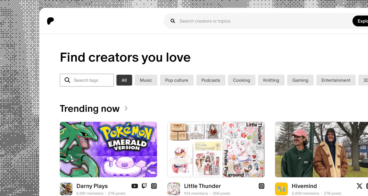
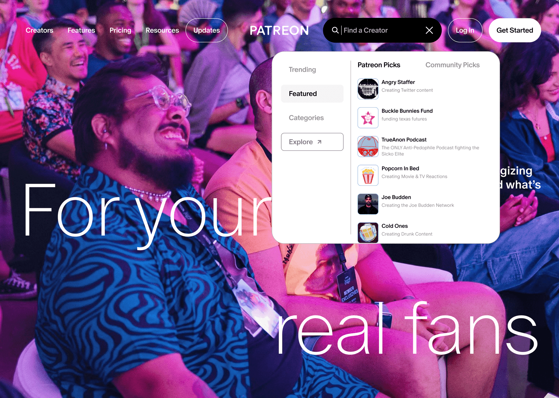
The old search bar gave you nothing until you typed, so you had to already know who you were looking for. Now clicking into it opens a menu with four ways in: Trending, Featured, Categories, and Explore. Explore used to be reachable only through a blank search, so we gave it its own entry and styled it differently so it reads as a destination.
Featured holds Patreon and Community Picks, which are creators the Patreon team likes and the community is already backing. Putting the team's picks up front makes Patreon feel a little more human and gives users another starting point to explore.
Categories is a plain list of popular categories with an "Explore all" link at the bottom, which takes the user to the explore page.
Creator cards you can judge at a glance
The old cards made you open a profile just to figure out what a creator did. Each card now shows a thumbnail, avatar, name, member and post counts, social links, and category tags. The thumbnail came straight from an interview: one participant asked for a quick picture or video snippet so they'd know what a creator was about, even if they ended up swiping past.
Member and post counts are there because participants kept pointing to existing numbers as a signal when deciding whether a creator was worth paying for.
Crowd Favourites ranks creators by how fast they're growing relative to their current member count. We chose that on purpose so smaller creators building strong communities get the same shot as the big names.
Results that match what you searched
When someone types a query, they usually have a direction in mind, and the old results ignored it. We built results around category tags and semantic search, so results get closer to what someone meant.
Category tags on every result make the list readable at a glance, so fans can tell what a creator actually posts about before they commit to opening a profile.
Thumbnails give fans a quick look at the kind of content they'd be paying into, so they can decide whether to click through without guessing from a name and avatar alone.
Filters, the most requested feature
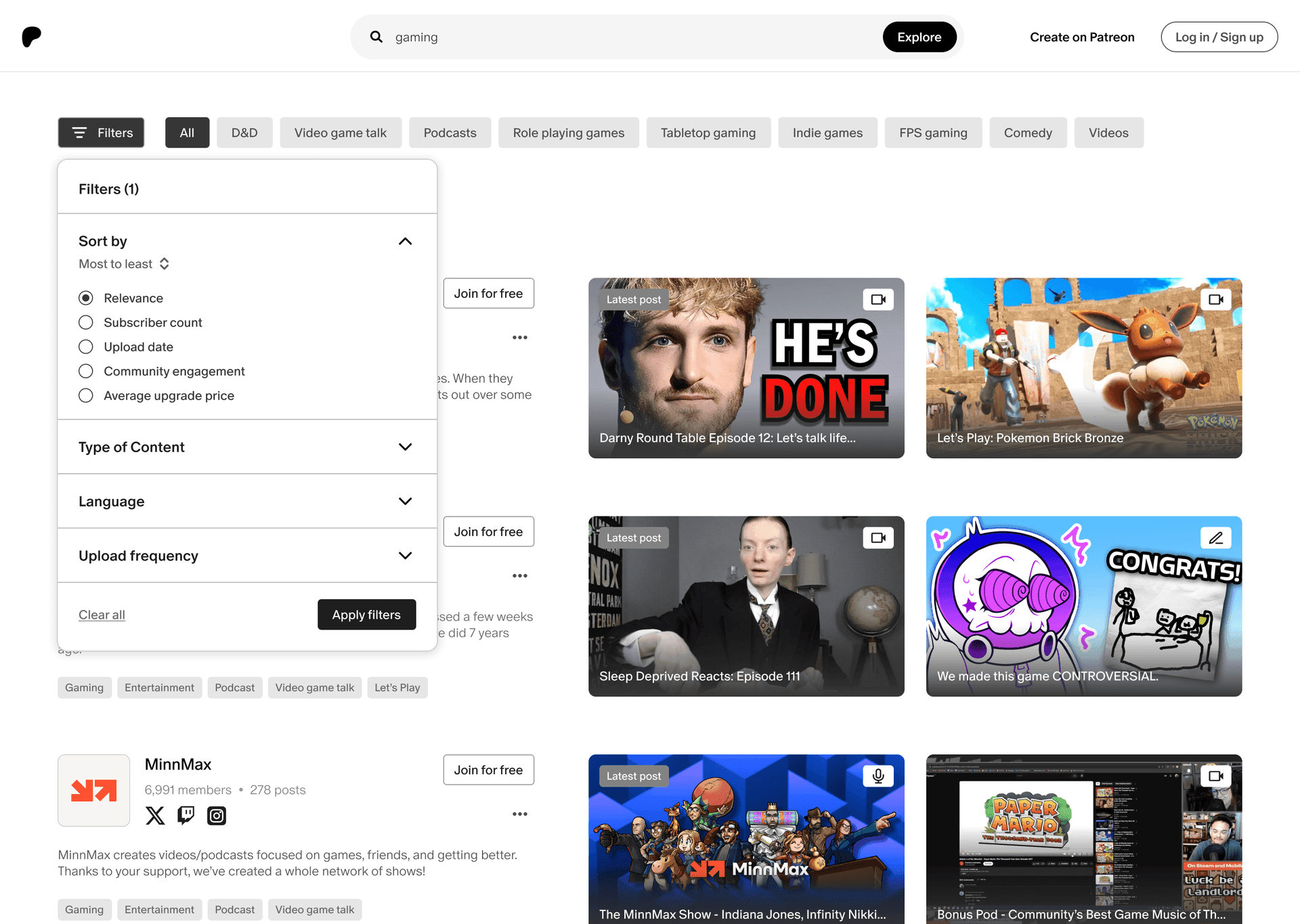
Filters came up more than any other feature in our interviews. When following someone costs money, not being able to narrow results makes the whole experience feel less trustworthy. Fans can sort by relevance, subscriber count, upload date, community engagement, or upgrade price, and filter by category, price, and rating.
Price shows up as both a sort and a filter, because cost came up again and again when participants talked about whether they'd pay.
A filter count and a Clear all link make it easy to back out and try again without starting the search over.
[4/5]
Outcome
A clearer path from search to creator
We redesigned 3 flows: the search bar, the explore page, and search results. This stayed a concept. The bootcamp got tight at the end, so we didn't test the final designs or measure anything live. The next step would be putting these screens in front of fans and at least one creator to see if the added context changes who people click on.
Search menu
1 / 5
[5/5]
Reflections
What I'd do differently
Reflection 1
Interview creators too.
We talked to 2 Patreon users and 1 non-user, which gave us a good read on how fans find content and what gets them to pay. We never talked to a creator. Creators are half of Patreon, and hearing how they get discovered (on and off the platform) would have shaped how we highlight them on explore.
Reflection 2
Agree on must-haves before splitting up.
My partner and I each designed a full direction and then merged. That gave us a wide range of ideas, but a short list of must-haves we both agreed on up front would have kept us closer to one goal. It also would have left time for things we cut, like predictive search, which I still think would help fans figure out what's out there.
Reflection 3
Asking why explore was so basic.
The rest of Patreon's UI is polished, so I kept wondering why explore felt so bare. My best guess is it was a practical call: fans usually arrive already convinced by a creator's free content, so a great explore page probably wasn't worth the investment. Being able to design something better doesn't automatically mean a company should build it, and on a real team I'd raise that question before designing.

Arnold Wei
Open to product design roles!
Currently in
Orange County, CA