 Athesports
Getting team content from coaches to players
Athesports
Role
Solo PD (design + frontend build)
Timeline
1 week (2026)
Team
Me, 2 Eng (backend & code review)
Tool Stack
Figma, Cursor
Auth
1 / 9
About Athes

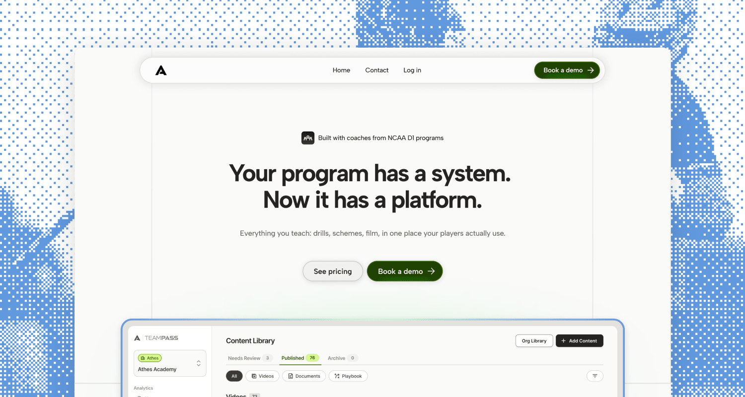
Athes is a desktop platform and mobile app for sports teams. Coaches use it to share drills, schematics, and strategy, and players review that material after practice so they keep learning off the field.
[1/5]
Problem
The business changed, and onboarding didn't
When Athes switched from B2C to B2B, our player onboarding was still built for the old model. Before, kids signed up for a subscription to get coaching, so the flow paced them toward a mentor match and a paywall. Now their team has already paid, and a player signs up just to join it.
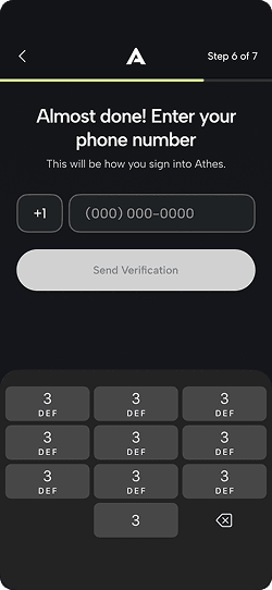
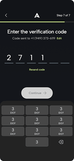
That gave onboarding a different job. It needed to get a kid onto their team and set up their account quickly, while staying fun enough for an 8 to 16 year old to want to finish.
Demographic
Youth lacrosse players (ages 8 to 16) invited to Athes by their coach
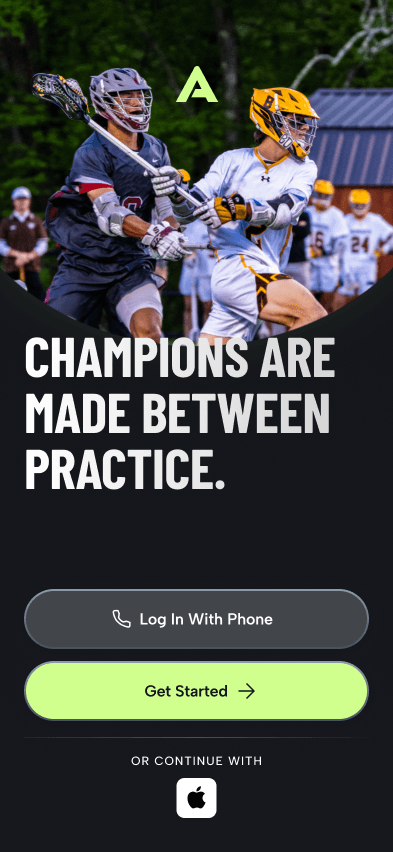
Old design
Built for B2C, with a mentor pairing system and a soft paywall.
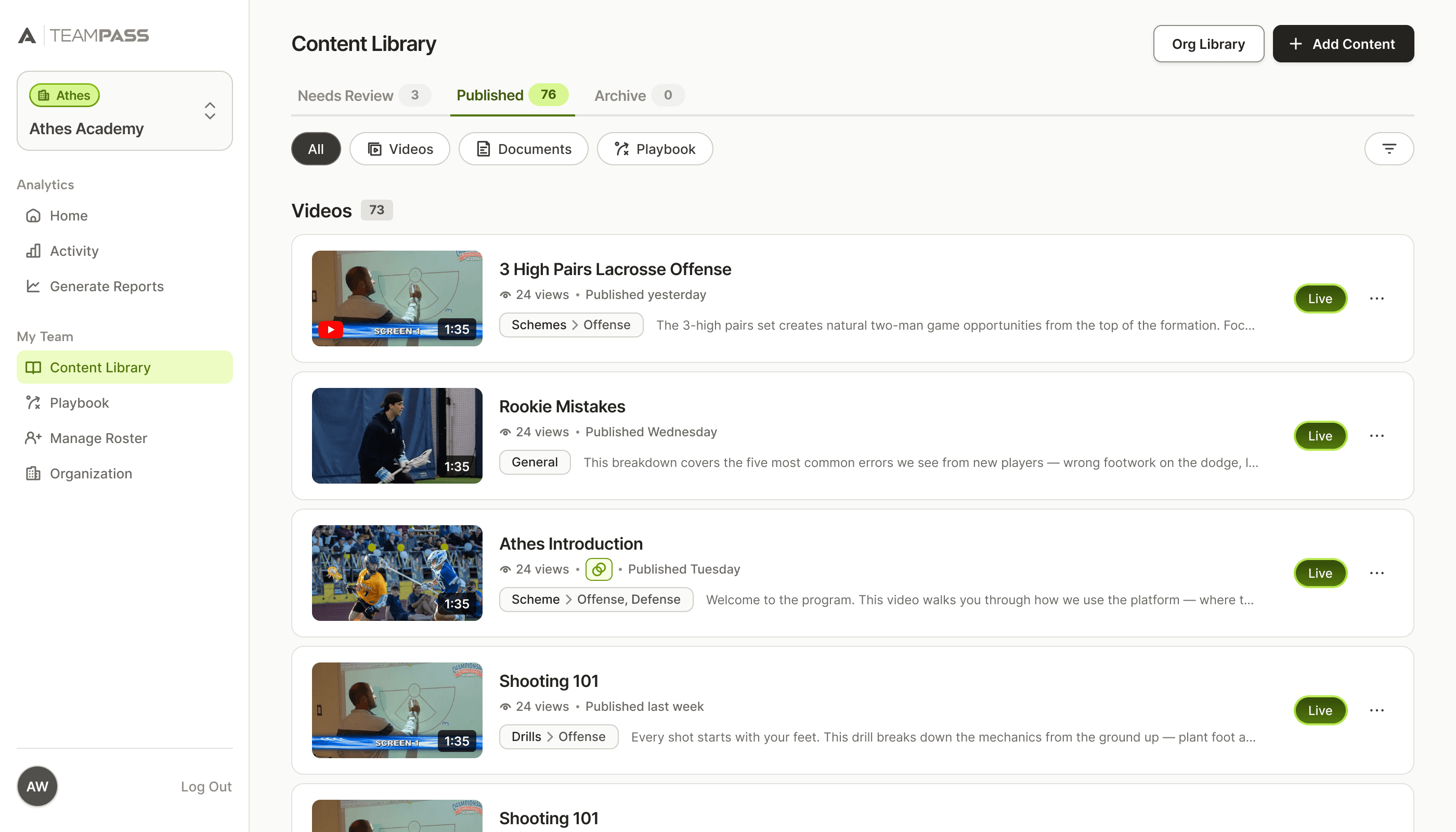
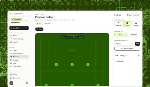
Our new B2B desktop platform. The mobile onboarding had to catch up to it.
[2/5]
Approach
One week, tied to the B2B launch
Our founder led the pivot to B2B, and I owned the onboarding experience. Before I started, the engineers and I talked through the structure of the flow so everything I designed would work on the backend. From there, I designed in Figma and built the front end myself in Cursor, with one engineer hooking up the backend and another reviewing my code.
With one week and a launch date, there wasn't time for a research cycle. I made calls based on what we knew about how coaches and players would use Athes, and on three goals.
Goal 1
Get players onto their team quickly and confidently
Goal 2
Collect account info without making it feel like a form
Goal 3
Make a few moments fun in ways that suit younger kids
[3/5]
Execution
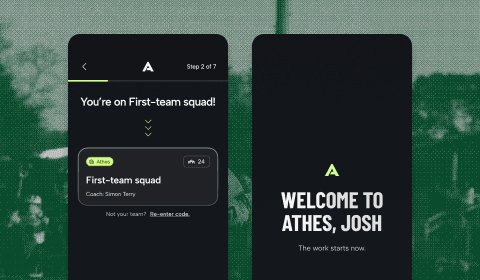
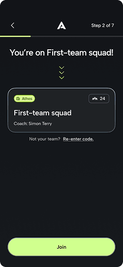
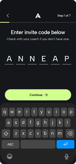
One code from the coach, and you're in
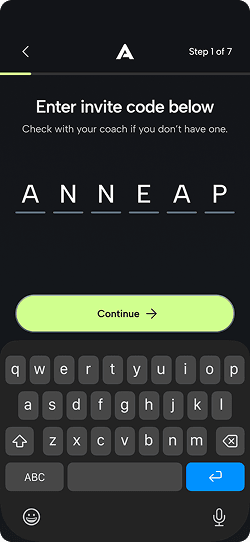
I went with a team invite code because it was the easiest option for everyone to understand. Coaches are already stretched between running their team and making time for each player, so having them add every player by hand was too much. A QR code works in person, but Athes is a post-practice app and we expected most signups to happen at home, where a kid might not know what to do with one.
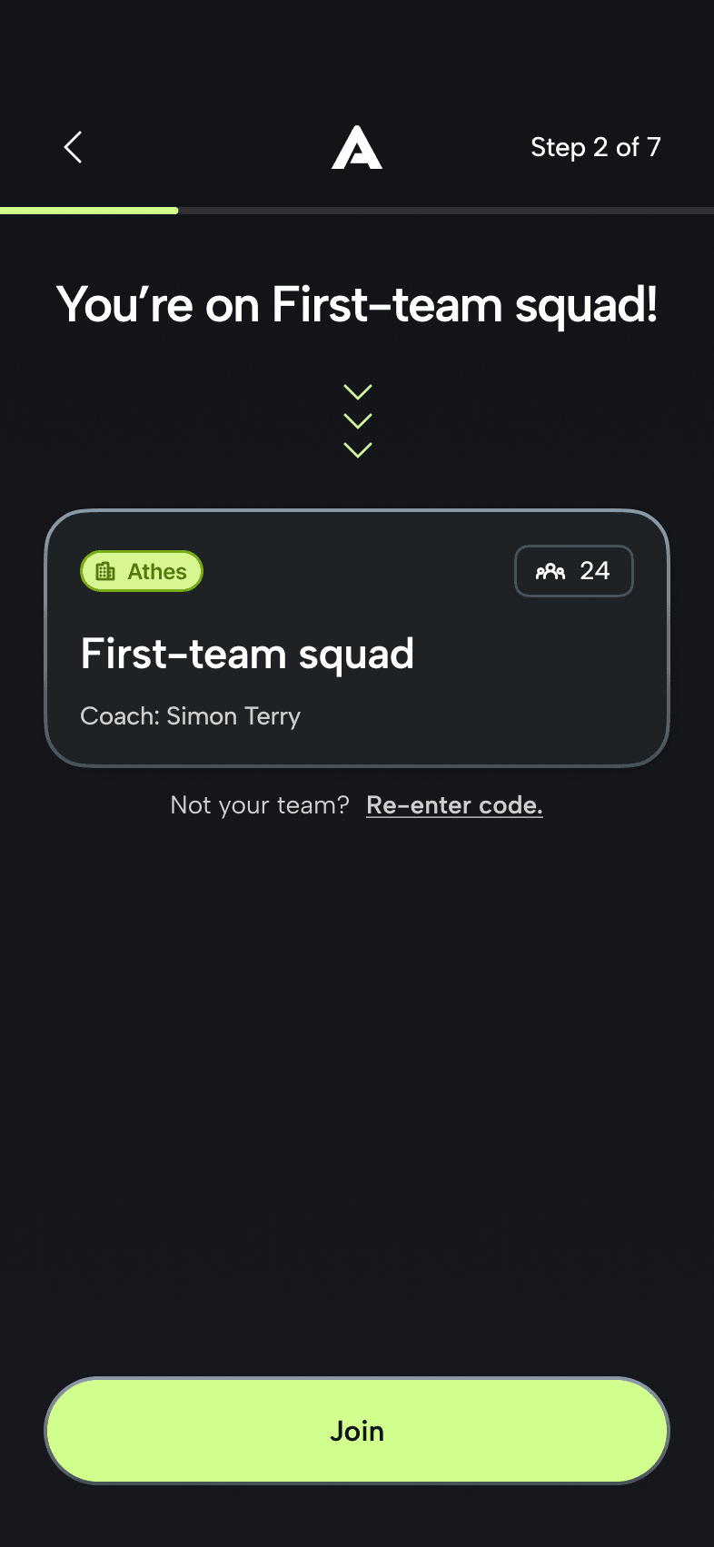
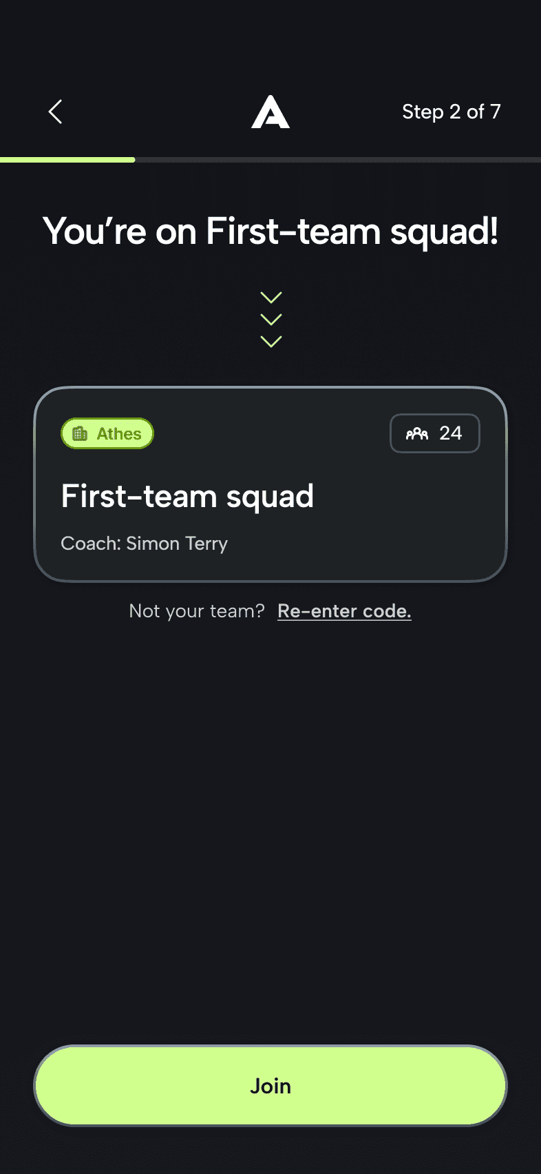
Since we weren't selling anything anymore, I focused on making this part enjoyable for younger kids. Seeing their team for the first time should feel like a proud moment, so I treated it as the main screen of the flow.
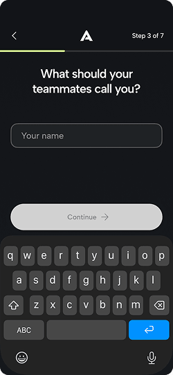
Once the last letter of the code lands, it auto-submits and finds the team. Continue is still there for kids who expect to tap it, but nobody has to wait around to see if it worked.
The team reveal animates in, and the copy reads like a welcome instead of a confirmation. I wanted kids to see their team and coach name and feel excited to hit Join.
Trading a little speed for attention
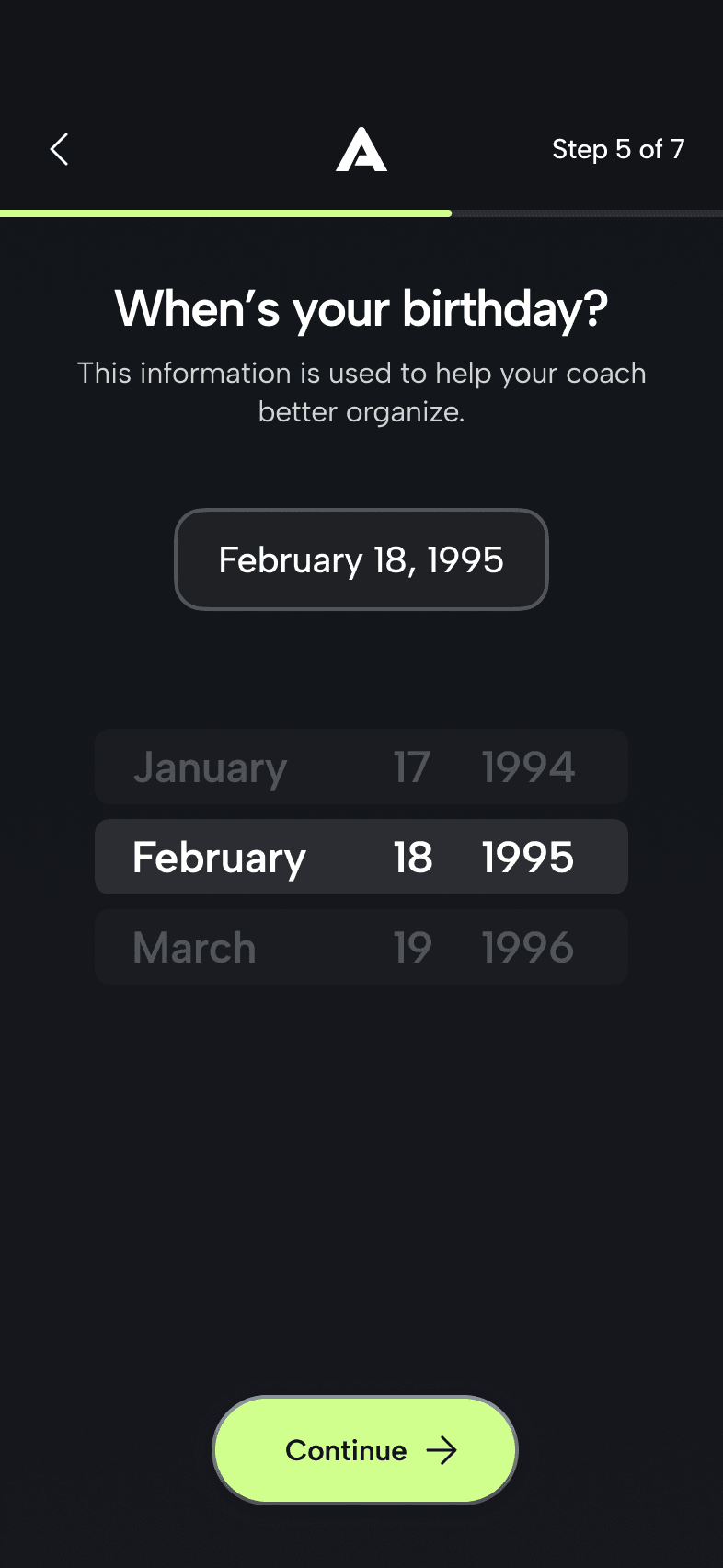
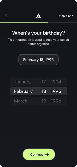
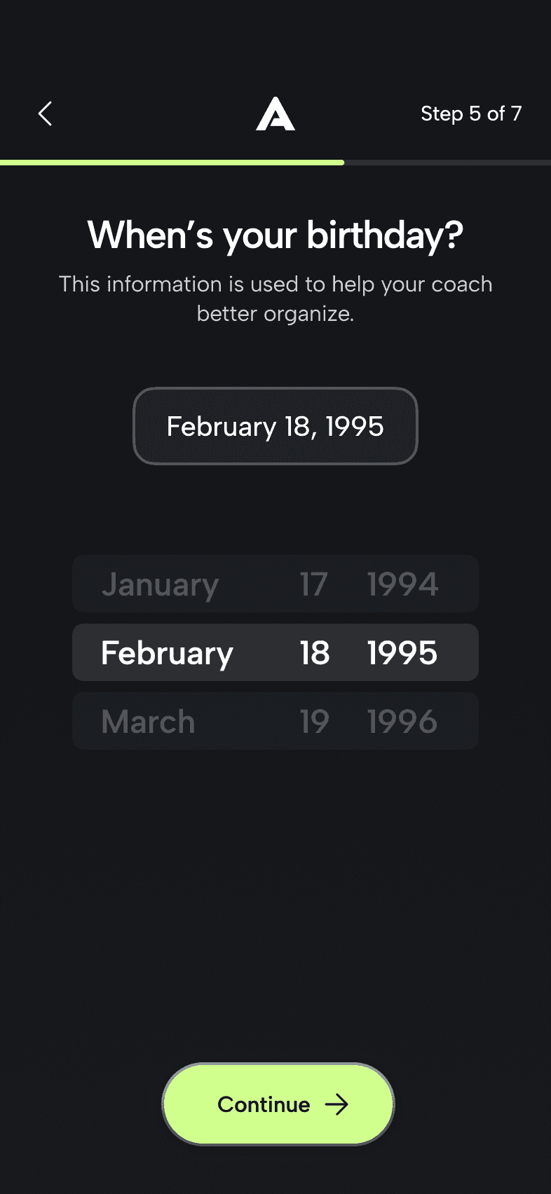
The birthday field started as a text input that auto-filled the slashes. I switched it to a scroll picker with haptic feedback on each tick, even though typing is technically faster. For 8 to 16 year olds, changing up how each screen looks and feels helps hold their attention, and for one low-stakes field, that mattered more to me than speed.
The picker always lands on a real date, so Continue stays visible, same as the invite code. Making it more fun didn't mean removing the safety net.
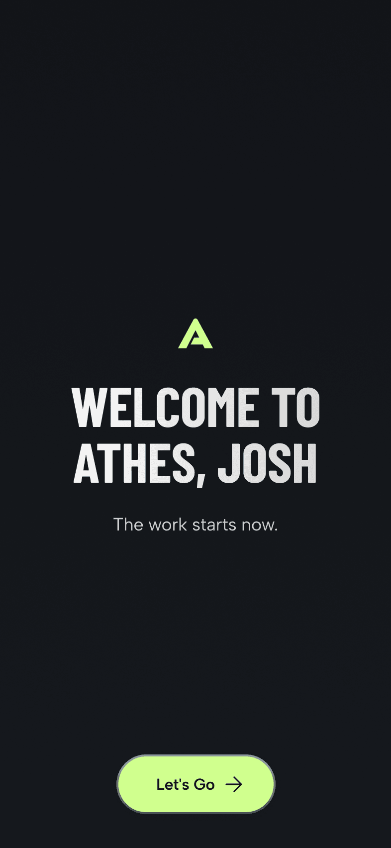
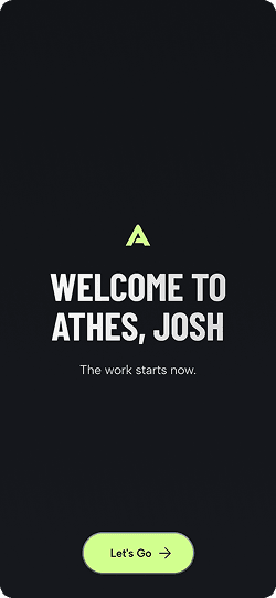
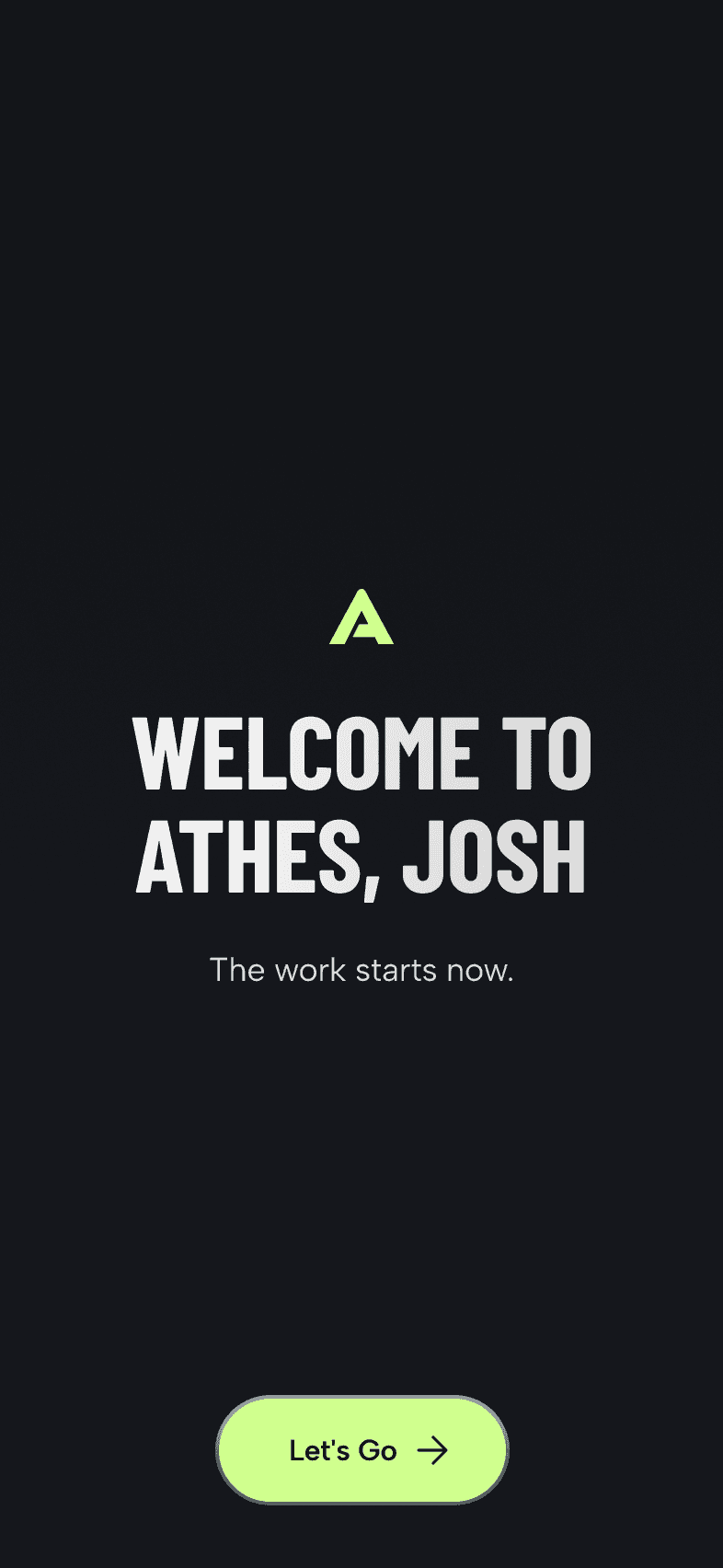
"Welcome to Athes, Josh" uses the player's name, and "the work starts now" points them toward the team they just joined. I wanted the last screen to feel like a starting line.
[4/5]
Outcome
Early testers called it fast and easy
We tested the new flow with coaches and a few young lacrosse players (friends of our founder's kid), and they described it as fast and easy to get through. Athes is still in building mode, so there's no funnel data yet. Once teams start onboarding for real, I want to track where players drop off so I have numbers to point to.
Auth
1 / 9
[5/5]
Reflections
Thoughts & reflections
Reflection 1
More creative screen transitions.
Motion is one of the most engaging things you can give kids. I used it on the team reveal and the birthday picker, but I've learned a lot more about interaction design since then, and I'd push the transitions between screens much further now.
Reflection 2
One or two screens that feel personal.
We kept the flow short on purpose. With more time, I'd explore a couple of playful screens asking things like a kid's height or whether they're a lefty or righty, so the app starts to feel like theirs before they're even in it.
Reflection 3
Knowing what actually gets kids through.
Players already have a reason to finish onboarding, because their coach asked them to sign up. So the extra motion isn't what gets them through. I still think it's worth doing, because I want kids to feel good about joining their team, and it's a skill I want to keep building.

Arnold Wei
Open to product design roles!
Currently in
Orange County, CA